Data Grid - Getting started
Get started with the last React data grid you will need. Install the package, configure the columns, provide rows and you are set.
Installation
Using your favorite package manager, install @material-ui/x-grid for the full-featured enterprise grid, or @material-ui/data-grid for the free community version.
// with npm
npm install @material-ui/data-grid

// with yarn
yarn add @material-ui/data-grid
The grid has a peer dependency on Material-UI core components. If you are not already using Material-UI in your project, you can install it with:
// with npm
npm install @material-ui/core

// with yarn
yarn add @material-ui/core
Quick start
First, you have to import the component as below.
To avoid name conflicts the component is named XGrid for the full-featured enterprise grid, and DataGrid for the free community version.
import { DataGrid } from '@material-ui/data-grid';
Define rows
Rows are key-value pair objects, mapping column names as keys with their values. You should also provide an id on each row to allow delta updates and better performance.
Here is an example
const rows: GridRowsProp = [
  { id: 1, col1: 'Hello', col2: 'World' },
  { id: 2, col1: 'XGrid', col2: 'is Awesome' },
  { id: 3, col1: 'Material-UI', col2: 'is Amazing' },
];
Define columns
Comparable to rows, columns are objects defined with a set of attributes of the GridColDef interface.
They are mapped to rows through their field property.
const columns: GridColDef[] = [
  { field: 'col1', headerName: 'Column 1', width: 150 },
  { field: 'col2', headerName: 'Column 2', width: 150 },
];
You can import GridColDef to see all column properties.
Demo
Putting it together, this all you need to get started, as you can see in this live and interactive demo:
import React from 'react';
import { DataGrid, GridRowsProp, GridColDef } from '@material-ui/data-grid';

const rows: GridRowsProp = [
  { id: 1, col1: 'Hello', col2: 'World' },
  { id: 2, col1: 'XGrid', col2: 'is Awesome' },
  { id: 3, col1: 'Material-UI', col2: 'is Amazing' },
];

const columns: GridColDef[] = [
  { field: 'col1', headerName: 'Column 1', width: 150 },
  { field: 'col2', headerName: 'Column 2', width: 150 },
];

export default function App() {
  return (
    <div style={{ height: 300, width: '100%' }}>
      <DataGrid rows={rows} columns={columns} />
    </div>
  );
}
Enterprise
The data grid comes in 2 versions:
DataGridMIT licensed as part of the community edition. It's an extension of@material-ui/core.XGridCommercially licensed as part of the X product line offering.
The features only available in the commercial version are suffixed with a icon for the pro plan or a icon for the premium plan.
You can check the feature comparison for more details. See Pricing for details on purchasing licenses.
Try XGrid for free
You are free to try out XGrid as long as it's not used for a project intended for production.
Please take the component for a test run, no need to contact us.
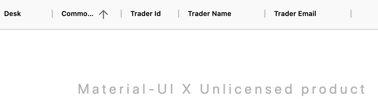
Invalid license
If you have an enterprise grid running with an expired or missing license key, the grid displays a watermark, and a warning is shown in the console (Material-UI Unlicensed product).
Feature comparison
The following table summarizes the features available in the community DataGrid and enterprise XGrid components. All the features of the community version are available in the enterprise one. The enterprise components comes in two plans: Pro and Premium.
| Features | Community | Pro | Premium |
|---|---|---|---|
| Column | |||
| Column resizing | ❌ | ✅ | ✅ |
| Column groups | 🚧 | 🚧 | 🚧 |
| Column reorder | ❌ | ✅ | ✅ |
| Column pinning | ❌ | 🚧 | 🚧 |
| Column spanning | 🚧 | 🚧 | 🚧 |
| Rows | |||
| Rows sorting | ✅ | ✅ | ✅ |
| Rows height | ✅ | ✅ | ✅ |
| Rows spanning | 🚧 | 🚧 | 🚧 |
| Rows reorder | ❌ | 🚧 | 🚧 |
| Selection | |||
| Row selection | ✅ | ✅ | ✅ |
| Multi-row selection | ❌ | ✅ | ✅ |
| Range selection | ❌ | ❌ | 🚧 |
| Filtering | |||
| Column filters | ✅ | ✅ | ✅ |
| Multi-column filtering | ❌ | ✅ | ✅ |
| Quick filter | 🚧 | 🚧 | 🚧 |
| Pagination | |||
| Pagination | ✅ | ✅ | ✅ |
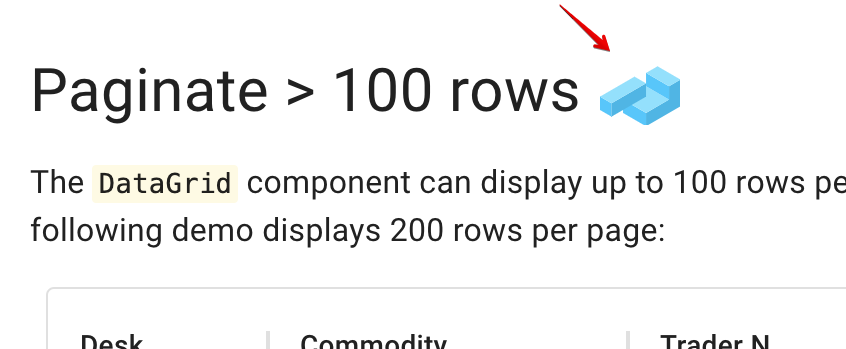
| Pagination > 100 rows per page | ❌ | ✅ | ✅ |
| Editing | |||
| Row edition | 🚧 | 🚧 | 🚧 |
| Cell editing | 🚧 | 🚧 | 🚧 |
| Import & export | |||
| CSV export | ✅ | ✅ | ✅ |
| 🚧 | 🚧 | 🚧 | |
| Excel export | ❌ | ❌ | 🚧 |
| Clipboard | ❌ | 🚧 | 🚧 |
| Rendering | |||
| Column virtualization | ✅ | ✅ | ✅ |
| Row virtualization > 100 rows | ❌ | ✅ | ✅ |
| Components | ✅ | ✅ | ✅ |
| Group & Pivot | |||
| Tree data | ❌ | 🚧 | 🚧 |
| Master detail | ❌ | 🚧 | 🚧 |
| Grouping | ❌ | ❌ | 🚧 |
| Aggregation | ❌ | ❌ | 🚧 |
| Pivoting | ❌ | ❌ | 🚧 |
| Misc | |||
| Accessibility | ✅ | ✅ | ✅ |
| Keyboard navigation | ✅ | ✅ | ✅ |
| Localization | ✅ | ✅ | ✅ |
License key installation
Once you purchase a license, you'll receive a license key. This key should be provided to the enterprise package to remove the watermark and the warnings in the console.
import { LicenseInfo } from '@material-ui/x-grid';

LicenseInfo.setLicenseKey(
  'x0jTPl0USVkVZV0SsMjM1kDNyADM5cjM2ETPZJVSQhVRsIDN0YTM6IVREJ1T0b9586ef25c9853decfa7709eee27a1e',
);
The grid checks the key without making any network requests.
Support
For crowdsourced technical questions from expert Material-UI devs in our community. Also frequented by the Material-UI core team.
GitHub 
We use GitHub issues exclusively as a bug and feature request tracker. If you think you have found a bug, or have a new feature idea, please start by making sure it hasn't already been reported or fixed. You can search through existing issues and pull requests to see if someone has reported one similar to yours.
StackOverflow 
For crowdsourced technical questions from expert Material-UI devs in our community. Also frequented by the Material-UI core team.
Enterprise support
We provide a private support channel for enterprise customers.
Roadmap
Here is the public roadmap. It's organized by quarter.
⚠️ Disclaimer: We operate in a dynamic environment, and things are subject to change. The information provided is intended to outline the general framework direction, for informational purposes only. We may decide to add or remove new items at any time, depending on our capability to deliver while meeting our quality standards. The development, releases, and timing of any features or functionality remains at the sole discretion of Material-UI. The roadmap does not represent a commitment, obligation, or promise to deliver at any time.